Order More, Save More with our Bulk Discounts Rush Order? Contact us now

Need Artwork Help?

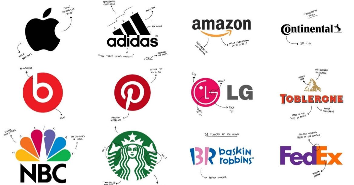
Thinking of a logo that perfectly represents your business can be difficult and time consuming. If you’re just starting your new business or brand, there is an endless list of jobs to complete before opening. If you’ve already started and looking for a rebrand – you don’t have to tell us, we know how busy work can be. In this blog post we are going to help you narrow down which direction to take your business logo.

Here at Uniform Me and Brand Me Australia we have been working with client’s artwork, logo updates and brainstorming new ideas for over 15 years. We know how important a logo can be. It can be the difference between getting noticed or being looked passed.

Do you have a long business name? Consider shortening it to 2-4 letter initials -

Monogram Logos are logos that consist of letters and used primarily for shortened brand initials. Take for example NASA, CNN & HBO. With a few words to consider, they’ve decided to employ their initials for brand-identification purposes. The design is all about simplicity and readability. Take for example, how much easier is it to say NASA as opposed to the National Aeronautics and Space Administration. Another great idea is to add the full name of your business below or alongside your logo. This allows people that are unfamiliar with your brand to still recognise services you offer.

Do you want your business name to stand out and don’t want to use a logo or icon?

Similar to a Monogram Logo, a Word Mark is a logo that is font-based and focuses solely on the brands name. If your business has a short and unique name then a Word Mark logo would work perfectly. Take for example Coca-Cola, VISA and Google – who have updated their logo continuously for key events such as holidays and historical dates.

If you already have strong brand identity and want to simplify your logo –

A Pictorial Logo is essentially an icon. When thinking about iconic brand logos, two that jump out are Apple’s logo and Twitter’s bird icon. Each of these company’s logos are so recognisable that there is no need to add text. A true Pictorial Logo is simply an image with no text or words included. Because of this, we only recommend this for clients who have a strong brand identity already.

Love the idea of a logo but don’t have strong brand identity yet?

An Abstract Mark is a specific type of pictorial logo. Instead of being a recognizable image—like an apple or a bird—it’s an icon that mostly is used in conjunction with a font.  Like all logo designs, abstract marks work really well because they compact your brand into a single image. However, instead of being restricted to a picture of something recognizable to your industry, abstract logos allow you to create something truly unique to represent your brand. A few famous examples would be the Adidas flower, Nike swoosh or Play station symbol.

Want to incorporate a logo and typography to create something truly unique?

A Combination Mark is a logo that includes a combination of a Word Mark / Monogram Logo and a Pictorial Mark / Abstract Mark. The picture and text can be laid out alongside, on top of each other, or incorporated together to create your logo. Some well known logos who have implemented this include Doritos, Hungry Jacks and Lacoste.

Want a logo that consists of a font inside of a symbol or icon?

Emblem Logos tend to have a traditional look to them but can still make a remarkable impact; as a result they are often the go-to choice for many schools, organizations or government agencies. This is also a very popular logo choice for those in the auto industry. While they have a classic style, some companies have successfully updated the conventional emblem logo to fit in with the 21st century. A great example of this would be Harley Davidson’s, Samsung and The Salvation Army. 

FINAL THOUGHTS

We hope this article has helped you indentify and narrow down what logo best suits your vision. We understand it can be time consuming and often expensive to hire a graphic designer to come up with a unique design. That’s why we here at Uniform Me and Brand Me Australia have Start Up Packages designed to help those starting out on a budget. However, if you are after a more in depth rebranding we can show you our Premium Packages which are more suited for you.

Your cart is empty
Search

Select Currency

{CC} - {CN}